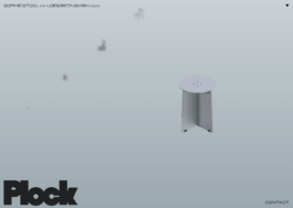
Design and implementation of a website for a befriended product designer launching his own business.
Brief
Plock works primarily with raw metal and has a strong interest in retro aesthetics and vintage typography, which led us to choose a Eurostile-inspired typeface also seen in 2001: A Space Odyssey.
The greenish-grey background references early computer interfaces and complements the tones of untreated steel, especially in workshop settings.
The product overview draws on planetary motion and retro game character screens, while the pill-shaped property tags are inspired by version labels on platforms like GitHub, resulting in a layout that centers attention on product imagery, just as Plock envisioned.
The preview images were rendered in blender.
Approach


Desktop
Landing
Landing II
Landing III
Product
Product II
Product III
Product IV
Index
Contact
| Fonts | Michroma Nunito Regular |
|---|---|
| CMS | WORDPRESS (LAYTHEME) |
Details


Mobile
Landing
Landing II
Product
Product II
Product III
Product IV
Contact

online
Website
2025
Website
online
2025