Self-initiated product analysis and redesign of a fitness membership app to improve usability and update the visual language to current iOS standards.
Brief
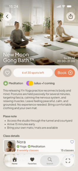
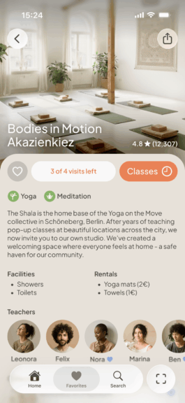
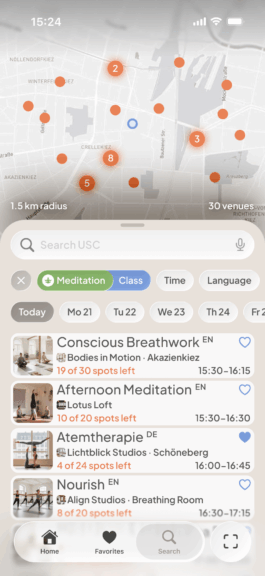
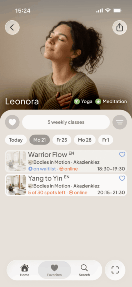
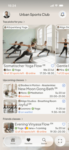
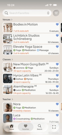
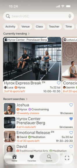
The current app requires too many steps to reach favorite venues and lacks options to save classes or filter by teachers. Collectives with multiple locations are hard to overview, and search features are fragmented, requiring constant tab-switching. The poor differentiation between in-person and online classes, combined with missing teacher filters, leads venue-owners to create workarounds like separate venue entries for different teachers or “online-only” venues.
Problem
The navigation is restructured into four clear sections: a personalized Home with upcoming classes and suggestions; a Favorites area for venues, classes and teachers; a Search section with refined filters and map view; and a prominent Check-in button for quick access.
Key improvements include savable recurring classes, clear distinction between in-person/online/hybrid formats, color-coded booking states (booked, waitlisted, full), and compact object panels showing 8-9 items per screen versus 3-4 before. The redesign follows current iOS UIKit patterns with orange for actions and availability, blue for favorites and waitlisting.
Solution


| Fonts | Plus Jakarta Sans Apple SF Pro |
|---|---|
| Tools | Figma Design Affinity PHoto |
Details


online
Application
2026
Application
online
2026